Friday, February 18, 2005
Great (and Not So Great) Sites Which Need a Redesign
Some sites (many of them tech-oriented) are great on content but really need a redesign to shine. Following are some examples. As Paul Graham said in his book Hackers & Painters (I’m paraphrasing), I won’t precede sentences with “I think” or “in my opinion”, because then I’d have to do this with every sentence. Also note that I put a rel="nofollow” on every link here simply because most serve sample purposes, and some I wouldn’t link to in real life.
Python
The top left logo of Python.org looks like it reads “Pvthor”. Then there’s a second logo within the content, which is totally different style and bigger. There’s no spacing on the blue-on-blue navigation. The whole site looks too amateurish, like one of those “as long as the width is dynamic and filling the whole browser window, we’re doing OK.”
Joho the Blog
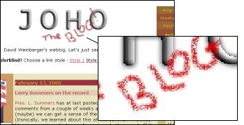
I love the blog itself, but I really don’t like the logo. It’s got an amateurish retro look and that might be the intention, but gray 3D letters with spray can effects I’m sure fail to impress most. For some reason though the logo reminds me of Deluxe Paint back on the Amiga, which must be a good thing.
Nielsen’s Alertbox
Nielsen is our usability guru, but him clinging to the outdated principle of not restricting the line-length (“The user is the master of his browser, and can resize it, use stylesheets, adjust the font settings”) is setting a bad example – and makes the individual usability essays harder to read.
Template-driven Blogs
I’ve got no specific URL for this, but there are many good sites which just rely on a default template provided by blogging services such as Blogger.com. Now there’s two major problems with that.
The first problem is that blogging services never offer enough different templates. This means visitors will be confused because of similar-looking sites they run into over and over. And when you actually never saw the template before, there’s our second problem... you can’t tell how much work went into the site and how professional it is*.
*I’m not saying all badly designed sites contain low-quality content, and that all great designed sites do contain great content, but there is a significant correlation: if you spent all day tweaking your content, there’s a big chance you will at one point also put some work into your site’s layout. The least that happens then is it will turn into individualistic, original design. You usually don’t create original designs if you just want to try something out for 5 minutes.
Doing random browsing you might have found a well-looking site, started to read for some seconds, to then find there might have been an interesting paragraph somewhere but that it’s otherwise full of “does this work?!” or “I’m boooored” posts. There was a time when sites like these had the fitting Geocities layout (centered text that would scroll down forever, interwoven with animated GIFs)... and as much as we might have disliked a typical Geocities design, it was a good instant indicator we have reason to stay away from this place.
But isn’t the whole purpose of blogging that it gives web publishing power to everyone, and wouldn’t it be elitist to demand everyone create their own design? Well, I could imagine a compromise between the opposing approaches. For example, there could be a much higher variety in the templates offered, and additionally, they could be created using a wizard. Then people would have to tweak details along the way. The outcome would actually tell us something about the site in terms of what the writer is trying to express. At the moment, this expression is lost on many blogs.
Drudge Report
Why’s he using a monospace font?
Wil Wheaton Dot Net
WilWheaton.net looks too much home-grown and too much purple. Other than that, I’d vote Wil Wheaton for Internet President anytime (him, or Dan Gillmor).
Amazon
Instead of amateurish “bad visuals”, the Amazon.com site (like many big sites) is just too crowded. I always wonder who reads all those links, and I’m a weekly buyer at Amazon.
My First Site
To be fair, my first site (if it was still online today) would deserve the crown of bad designs, even though I’m not sure it would fit the “great sites” category. And that doesn’t mean I regret anything, because these might have been necessary steps to take in the learning experience.
I started out at Geocities in 1997, after someone suggested to me to make a web page for my hobby computer games (and I started programming because I wanted to create computer games). So I taught myself HTML, and I didn’t want to use any WYSIWYG editor because a bad FrontPage experience from 1996 was still fresh in my memory; the sample site of ’96, which I prepared at my grandfather’s computer and which looked great in the editor’s Preview mode, failed to work in my then-favorite Netscape browser.
So here’s a small description of my old site, and thankfully I didn’t preserve those files anywhere I’d remember. There was a cyan-to-black bubble background which would tile seamlessly. There was a music piece looping in the background, and it was a techno cover of a rock song which I prepared in my Cakewalk MIDI editor. There was a frame to the left with the navigation and a frame to the right with the content. I created rotating “New” icons in Lightwave and stuck them on newly uploaded files (and I made those graphics public domain so others could use them). All HTML3.2, of course (I jumped on the CSS bandwagon in around 1998 and haven’t jumped off since).
In retrospect the biggest mistake however, aside from confusing technical trickery with good design, was the fact that I made a homepage and not a blog. The more I appreciate the conversationalist nature of weblogs, the more homepages feel dead to me.
“Little Block” Sites
Look at the IBM, Intel, UPS, Panasonic, HP or Dell front-pages to see what I mean: these are typical left-top-aligned “little block” big corporation sites, where supposedly someone in management gave the order users shouldn’t ever need to scroll vertically... truly one of the greatest misconceptions of web design, and if you too work in web development you probably experienced this before. All these little blocks neatly fit on 800*600 (or 640*480, in the past), but they don’t adapt well at all to bigger resolutions.
Call Center Woman Stock Photo Sites

Again there are too many of these sites to decide for one specific URL. It’s when the whole site cries “stock photo” and everywhere there’s small images of pretty smiling women in call centers doing customer support, funky laser-blue 3D “@” symbol coming out of the computer monitor, or men and women in suits sitting around a table discussing things (note: there will be exactly one person of every race on the planet sitting at the table, and there will be as many women and men, and as many people wear glasses as those who wear none, and there is no definite “leader” to make out in this group because they’re completely democratic, and there’s also no aggression in the air because come on this is the 21st century and we’re all adults here OK? And if this sounds like a complaint, it’s not... it’s just a funny coincidence it’s always like that, and the reason most stock photos are so void of soul).
AltaVista
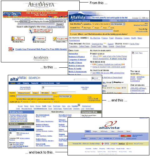
This story is in our past now, but back when AltaVista introduced pop-ups and portal-like features (long link lists leading to anywhere), this must have been the single most fatal error of any site since the beginning of the web. Just imagine they’d have started to make the site simpler instead. People would have switched to Google much slower, and AltaVista might have used this time won to improve their search by copying Google’s “links are everything” ranking approach. The tech-savvy crowd around ’99 liked AltaVista better than Yahoo... and who knows, we might still be using it today.
Hotmail
Would Hotmail actually be focussing on usability, and nothing else, then they’d cut about 100 links from their web mailer. As things are, I prefer Gmail where most links are there because you need them, and not because someone is trying to make money from something, or push their other services down your connection (in Gmail, the exception of course are the related Ads appearing to the right side of some mails... but they are relevant, rare and unobtrusive). The worst design error is Hotmail starts with a “Today” page and you have to click on the “Mail” tab to actually get to see your mail. When it comes to pure visuals, the blue is a little too heavy on my eyes, but that alone wouldn’t be too bad.
Web Standards Look Boring
I don’t think the design of The WebStandards Project is bad, it’s just that it’s so extra-simple it would make a great argument for those saying “standards equal boredom” and “I want more than boxes.”
Design Blogs
I’m saddened that many of the hands-down best design blogs use tiny, low-contrast fonts to get their point across. While the layout is impressive this completely destroys readability for me. I wish I could stop saying things like “small fonts are the biggest design problem on the web” but it’s still true: they are.
Google Groups 2
The new Google Groups design reminds us we shouldn’t confuse portal and search engine too much. Google Groups was a plain and simple search box, and it now turned into a newsgroup client. Which is fair enough for those who are seeking for a web-based news client, but I have my own desktop reader and don’t need this functionality. Now whenever I go to Google Groups to look for technical information (which happens several times a week at work), I’m confused by the clutter it presents to me; last visited newsgroups? New activity in groups I’ve posted to? Google, what makes you think we want any of that when we’re using your great newsgroup search?
Wired
I like Wired news, and they were one of the early adopters of CSS. But why do they need to split up every article into two pages? And while I’m at it, I’m also confused they always split up their articles in their offline paper version, so that you find yourself at page 30 and then you need to go to page 100 to read on. I’m sure there is some crazy reasoning behind this (let me know), and I’d guess this is common in the US, but I’m not used to this mostly reading German magazines the rest of the time. How can such a huge usability blunder make it into mainstream press and no one figured out a fix yet?
Flash Ads
Many otherwise good sites (especially mainstream news sources) have blinking, animated Flash ads right next to the text. This makes it harder to concentrate on the actual content you want to read. The most annoying flavor of these ads is when they float on top of the content and you need to close them after you located the tiny “x” somewhere... but that’s plain evil. It’s stuff like this which makes me uninstall flash on some of the machines I use.
Nasa
Nasa.gov doesn’t do too bad, but why does it have to look like a kid’s CD-ROM from ’99? And what’s with the blinking stars in the background?
Big Bold Yellow Highlight
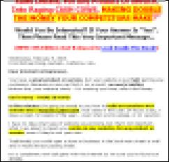
Actually, I could imagine sites in a style like this one are effective in selling things, and they are not ugly per se. I just find them annoying. They always scroll endlessly, contain a white background, a lot of big bold fonts, a lot of yellow marked text, “down to earth truthful” customer testimonials, and Visa and Mastercard icons somewhere at the bottom. And they’re always written in a direct, person-to-person, and somewhat spammy style: “Are YOU unhappy with... do you ALWAYS think it’s impossible to ... the SECRET proven expert advice helps you to ...” and so on. Mostly, these sites sell eBooks (PDF downloads) for instinct-buy prices (below $40).
Slashdot
I read Slashdot.org almost every day. So I wish it would have a good design, but it doesn’t. The major problem is that it’s too dark, unorganized and cluttered, and there’s no reason why all news items should be in italics. Options like seeing all comments on a thread are complicated, because the site is drowning in its own lingo. What does it mean if I set the “threshold of -1:54 comments to flat"? Does that mean I will see all comments? And why doesn’t Slashdot just use a thread’s title as link to another page where the thread expands?
Internet.com
Internet.com is one of the many portals which is too impressed by its own DHTML menu navigation. Even Microsoft stopped doing that. While I can’t point my finger at exactly why I don’t like these, it might be related to the fact that important information may be hidden so you start to go through every menu item to find what you’re after. This “lazy man’s clustering” goes by the wrong axiom that you need to stuff a sitemap into the front-page, and that plain links to more links would be the slower alternative. What the web design world needs is a study which would prove once and for all time that DHTML menus don’t improve on navigation.
Hilton
The Hilton site (the hotel, not the daughter) isn’t exceptionally bad or good, it’s just funny how people still splice their images hoping this will help anything (loading speed, image quality, etc.) ... see their main image, left center. Image splicing belongs to the Big Web Myth basement where it would collect dust next to Web Safe Colors and The Alt Tag.
Tech Menus
I’m unsure how to best describe this design style. If you ever watched Star Trek: The Next Generation, imagine those multi-colored flat monitors they use (as a side-note, those usually show outer space in 2D – I wonder if that makes sense). Every item is displayed in ultra high tech, 3Dish boxes. And that’s exactly what you see on certain sites, like StarWars.com. Those sites pretend to be some kind of computer OS or techno tool-box. But they’re not, so why pretend to be? The worst example of this can be seen at SEO Technologies... wow, is this Flash or a 21st century robot?
Waving Flags
Nothing against patriotism, but what’s better than an animated GIF of a waving flag as decisive design element on the site to show the web world you’re clueless & stuck in the past?
Affordable Web Design
If you’re offering web design, you better make your own site good-looking. Michael Williams, though inhibiting the top spot in Google for “web design new york”, is making every error in the book. Including ghosting, gray 3D logo, animated navigation, table cell borders, a tiling neon-colored background image that appears to be drafted in MS Paint, and a JavaScript widget which shows the date as “February 18, 105”. Come to think of, the site is actually more entertaining than most web design sites...
Lifehacker
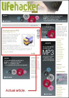
Lifehacker is one of the many popular blogs from the Gawker Media blog empire. The front-page isn’t bad, but individual posts are drowned within advertising. While it’s understandable the site wants to heavily promote its only sponsor, this could be done in much more meaningful and less obtrusive ways... especially when it’s one and the same ad being shown in 4 different banner formats all around the post (this makes no sense at all).
Gadgetopia
Gadgetopia is one of my favorite blogs, but I wish back to the time when there wasn’t a border and gray background around every post.
If after so much sub-optimal examples you are looking for actual good designs, Blogs by Their Covers and the CSS Zen Garden are worthwhile starting points (be prepared to get jealous if you have a blog).
>> More posts
Advertisement
This site unofficially covers Google™ and more with some rights reserved. Join our forum!