Wednesday, June 15, 2005
Yahoo Change Map
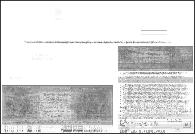
I’ve created a Yahoo change map by automatically saving a screenshot* of the Yahoo front-page every day for a month starting from 5/8/2005. The images were then overlayed, and using logical XOR filter for every consecutive image couple, only the changes were rendered (and then inverted). Finally, all images were overlayed and desaturated. What stays is a final map showing zones which change frequently on Yahoo in darker colors, and zones which change little or not at all in lighter colors.
*I’ve created the screenshots of Yahoo by “kidnapping” a little Google Flash application which explains AdSense to a user showing off any URL they enter. I guess Google uses Internet Explorer as underlying rendering engine. Thanks to Tony Ruscoe for the original idea of accessing Google’s flash, as posted in the forum.
Of course, this approach could be applied to all web sites. As opposed to changes on weblogs (where you are informed about what was altered, and the structure is always in reverse chronological order), changes on portals like Yahoo are not that easy to track. While it seems clear there are certain boxes on the Yahoo page which are bound to change often – supposedly manually, or according to some automated change plan – as a regular user, you might have missed the change of the third icon on top from “Travel” to “Autos.” This change created a small light gray spot in the change map.
It might be interesting to compare change maps of different types of web sites (naturally, different change maps can be overlayed again to create an aggregate change map). Blogs, for example, on average may or may not show off a common change map. Would mainstream news sites like CNN.com differ in any significant way?
>> More posts
Advertisement
This site unofficially covers Google™ and more with some rights reserved. Join our forum!