Tuesday, October 24, 2006
Joe’s Google Redesign: Search Efficiency
Joe Critchley (aka Mambo), now age 17, got his first computer when he was 8, and started making web pages when he was 11. He’s currently working as freelancer doing stuff like HTML, CSS, PHP and MySQL, as well as web design. Joe, who ponders going to University at a later point, says he’s loved Google since its early days but envisions a “Google 2.0”.
Introduction
I have spent several months creating new User Interfaces for Google. Not fully-working interfaces; just mock-ups. That’s what I enjoy doing, because I feel I’m doing it for a purpose. However, these mock-ups have often been simply for appearance. Skin deep. But now, in the first of several articles, I get into the nitty-gritty of Google, starting with Search Efficiency.
The Problem
People want to get the answer to their query as soon as possible. Google offers several ways to speed up the process. In the screenshot below, the annotations show the elements that make up the order of someone entering a query into Google.
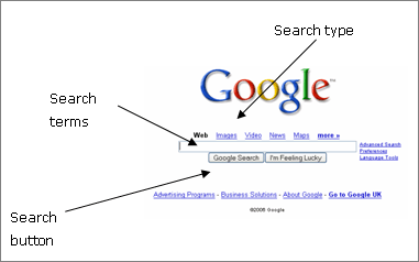
They can be in any order. This would most likely be Search type (e.g. Images), Search terms (e.g. “lara croft”), then a press of the Search button.
However, there should be a quicker way. Imagine if you could enter your query and then click “images” and the actual result comes up directly. However, we couldn’t use the current position of the search types. So, how do we fix it?
Idea 1
So, here’s my first idea.
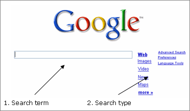
It’s easy to use. The person enters their search terms, and clicks the type of search it is, which also acts as a search submission. 2 for the price of 1.
To be honest, I quite like it. However, there are still some problems:
- Some people will be looking for a search button
- Links do not conform to HTML forms standards
- It’s not very aesthetic
- It’s not very obvious that you can click “Enter” on the keyboard to go straight to the web results
- There’s no “I’m Feeling Lucky”.
Idea 2
Idea 2 is getting there.

Advantages include a compact size (using only two columns). Also, the Google Search button is back. This puts more emphasis on the main kind of Google Search. Yet, it also acts as a heading for the rest of the search types.
Therefore, this design provides a solution to every problem stated for Idea 1, except for “I’m Feeling Lucky”. Well, for the interface not to get overcrowded, something special needs to happen. Here’s where things get a little tricky for the engineers
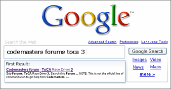
Idea 3
As you can see, this design actually gets rid of the I’m Feeling Lucky trademark, and replaces it with... “I’m Feeling Looky” (perhaps). Basically, it gives you a preview of the first result, before you even click to search. Now that’s efficient. But it is also quite unrealistic.
This design is probably not to everyone’s taste, as it is more cluttered than the current Google homepage. However, it is more efficient, and in a subtle way. And that was the aim of today.
Conclusion
This week, I have made a more efficient Google. That’s a near fact. But, for many, it’s a cluttered one. I will try to work on that next week – something along the lines of “Intuitive Search”.
>> More posts
Advertisement
This site unofficially covers Google™ and more with some rights reserved. Join our forum!